In order to create a Poster for our film, we analysed a few exisiting film posters from a similar genre. This is so we can follow the right code of conventions and address the right target audience with or poster.
KiDULTHOOD
The poster shows 7 youths on the what appears to be a roof top with an estate behind them, this immediately shows that its not a typical studio film. Every character is looking directly at the audience, this is called a direct mode of address and is used as an attempt to stimulate engagement with the target audience for the film.
The mise en scene including costume shows a stereotyped view of a modern teenager i.e. hoodies on the male characters and the male characters are black reflecting again refelecting modern urbanisation. One of the characters is holding a baseball bat showing the films theme of violence.
The lighting is very dark to portray that the film contains dark themes, this is also reflected by the solom expressions on all the characters faces showing that this is not a happy film.
The slogan at the bottom of the page says Before adulthood comes KiDULTHOOD reflecting the film is about the void between being a child and an adult.
The review at the top of the page shows 5 stars refelecting that this is a good film and it states "powerful, moving and unforgettable-kicks the door of its hinges" this again reflects the theme to its audience that its not a light hearted film.
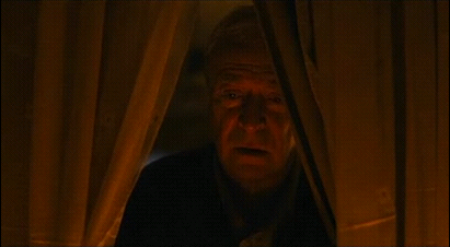
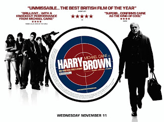
HARRY BROWN
T
his poster is highly edited. Single images of the actors have been taken and then placed together to create a poster. The is a bulls eye sign in the centre of the poster, this shows that Harry Brown was in the Marines when he was younger. The image of Harry Brown walking towards us is slightly larger than the images of the youths. This emphasize his power and strength against the youths. There are also positive Newspaper reviews at the top of the poster. Used to draw in potential viewers who aren't sure on whether to watch it or not.
The main image is a studio shot. We can tell this by the pure white background. This juxta positions the image of Harry Brown as it's a low angled shot expressing he is intimidating and could be dangerous. He is also carrying a pistol which has been enlarged to emphasise what he is capable of doing with it. Harry's face is covered in this poster adding mystery to his character. This is done because throughout the film Harry is an unknown killer to the police.
'Michael Caine' is written in big, bold, black letters, the same size as the tittle of the film. This is too attract Michael Caine fans who may not have been interested in the genre of the film but are big fans of his.

This poster is a location shot. There is a burning car in the background making the background of the poster completely red. This suggests anger, blood and death. Again supporting the themes without the film.
The slogan 'Every man has his breaking point' suggests that this man is just like every other. This means audience members can relate to Harry Brown, which makes this character more and more likable. He is also directly looking into the camera therefore creating a direct mode of address.
SKINS
Skins has a reputation of being a teen drama full of alcohol, drugs and parties. It's important to portray this when advertising the series so they attract the right audience. This poster has most of the charters looking drunk, or under the influence of drugs. The girl in the middle of the poster is 'Michelle', one of the main characters. Michelle is crying in the poster suggesting upset and drama. Too the right of the image is two characters kissing. This supports the sex theme. To the left is a girl past out which supports the alcohol and drugs theme.
This poster is for the second series of skins with new characters. Again the characters appear to be at a party under the influence of Drugs and alcohol. This time the main character appears to be happy, while her boyfriend tries to restrain her. This reinforces the mental health themes that occur this series. This happy look on her face draws audience members in however as it sets a positive vibe.
The lighting in the poster is different to the others, it's darker and very eary. There also isn't a party going on, instead it's quite a disturbing image. During the first series the character in the poster is hit by a bus and is brain damaged. By him being in the bath underwater it expresses his struggle in being able to do things on his own. This shows the audience that this series is going to be slightly different to the one before because as in the first series this character is the leader of the group and now he has to be looked after by his friends.