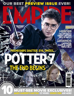
 We also had to create a film magazine cover to accompany our trailer and poster. In order to do this successfully we had to first analyse other film magazine covers in order to establish codes and conventions of a film magazine. The first magazine we decided to look at is Empire magazine, is a British film magazine published monthly by Bauer Media Group. Bauer Media Group is a large publishing group that is based in Germany but operates in 15 countries world wide. It also publishes chat magazines such as take a break and Bella as well as music magazines such as Q and Kerrang. The target audience is males age 18-24.
 The name Empire connotes something on a large scale and something above everything else which automatically hails the audience in because it makes them feel that by buying the magazine they belong to something big.
As you can see the mast head is in red a colour that denotes passion and is associated with power i.e red carpets for celebrities.
Each issue has a name e.g 'The 18th Birthday Issue,' The preview issue' and 'The hot issue.' Not only does this give the magazine a theme it also differentiates itself from other magazines and makes it feel unique which is an incentive for the reader to want to buy it.
Each issue also features a celebrity as the main focus on the cover, this gives the magazine familiarity and recognition.
The film that is being promoted is Harry Potter, however the cover line just says "POTTER 7" this gives a sense of familiarity to the target audience, which the distributor is assuming that the audience knows well. This also makes the reader feel as if they belong.
It also has a section of hero's and legends words commonly used in the fantasy genre which Harry Potter is, which again creates a theme and all calls out to to the target audience.
Its made to look as though hes just broken glass to create a dynamic exciting feel to the issue.
It features a mast head, cover line, a strap line, an issue number and a website address. The bar code is also on the right hand side of the cover.
 In This issue it features a topless Megan Fox; a sex symbol especially for the target audience of men of the age of 18-24. Shes looking provocatively into the camera which is a direct mode of address and an attempt to call out to the targeted audience.It is also slightly low angle to give her a sense of vunerablility. She also looks directly into the camera as an attempt to stimulate eye contact with the readers. Her tattos are showing to give the feel of intmacy; to make the reader feel like shes exposing things that she wouldnt normally.
The cover is simple in white to give a clean fresh look.

No comments:
Post a Comment